
MATCH – Groovy Matcha Beverage Concept
Project Overview
MATCH is a full creative concept built around a simple idea: making matcha fun, accessible and visually irresistible. The goal was to reimagine how matcha can be presented in modern retail, turning it into a cool, groovy and playful experience instead of the usual minimalistic “zen” aesthetic.
This project was created as a creative exploration, blending branding, packaging, retail design and lifestyle identity into a single cohesive universe.
Creative Direction
The MATCH world is intentionally bold, colorful, nostalgic and groovy, with inspirations taken from retro bubble lettering, 70s tones and feel-good vintage character. Everything about the brand is designed to feel happy, vibrant and memorable.
Packaging & Product Vision
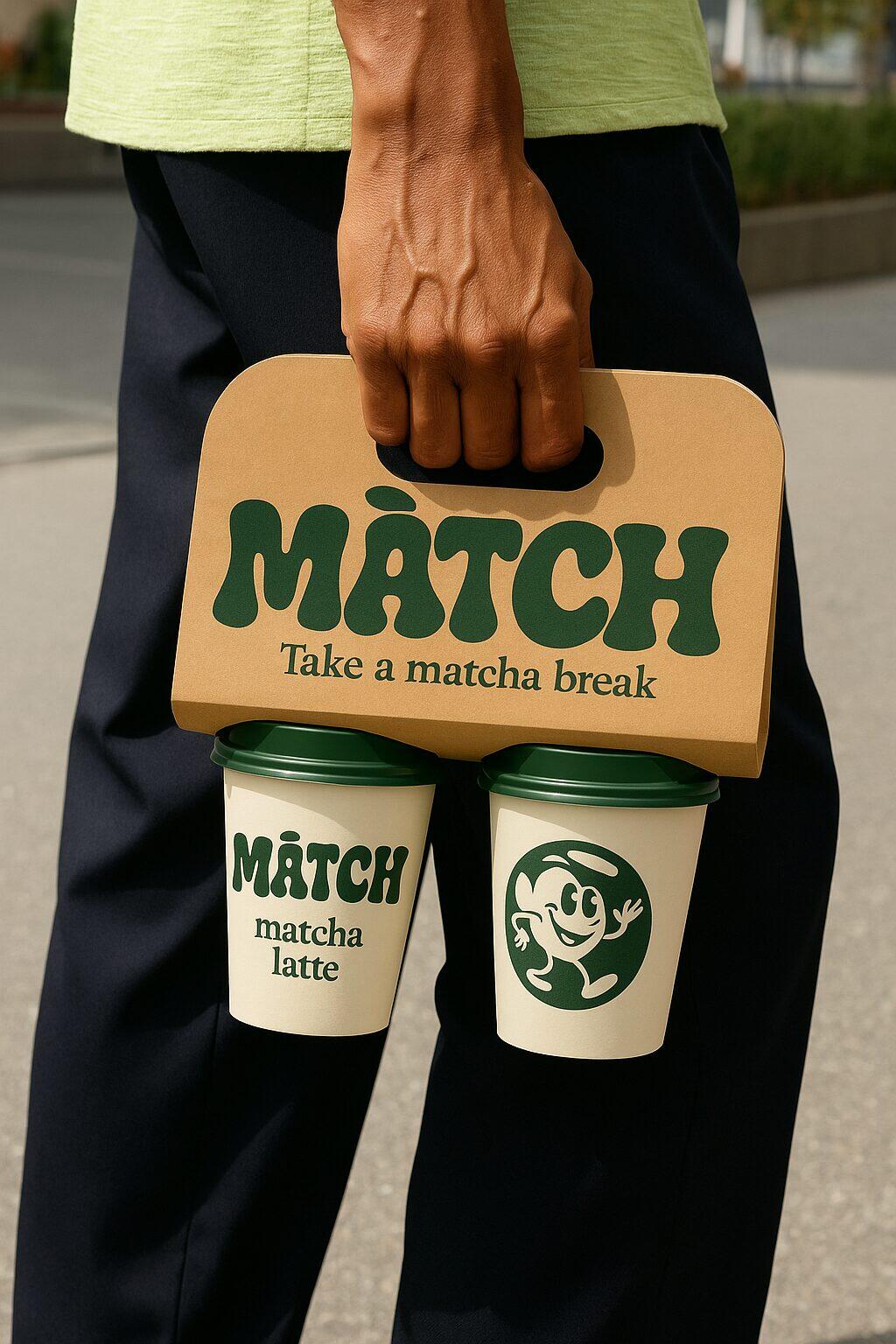
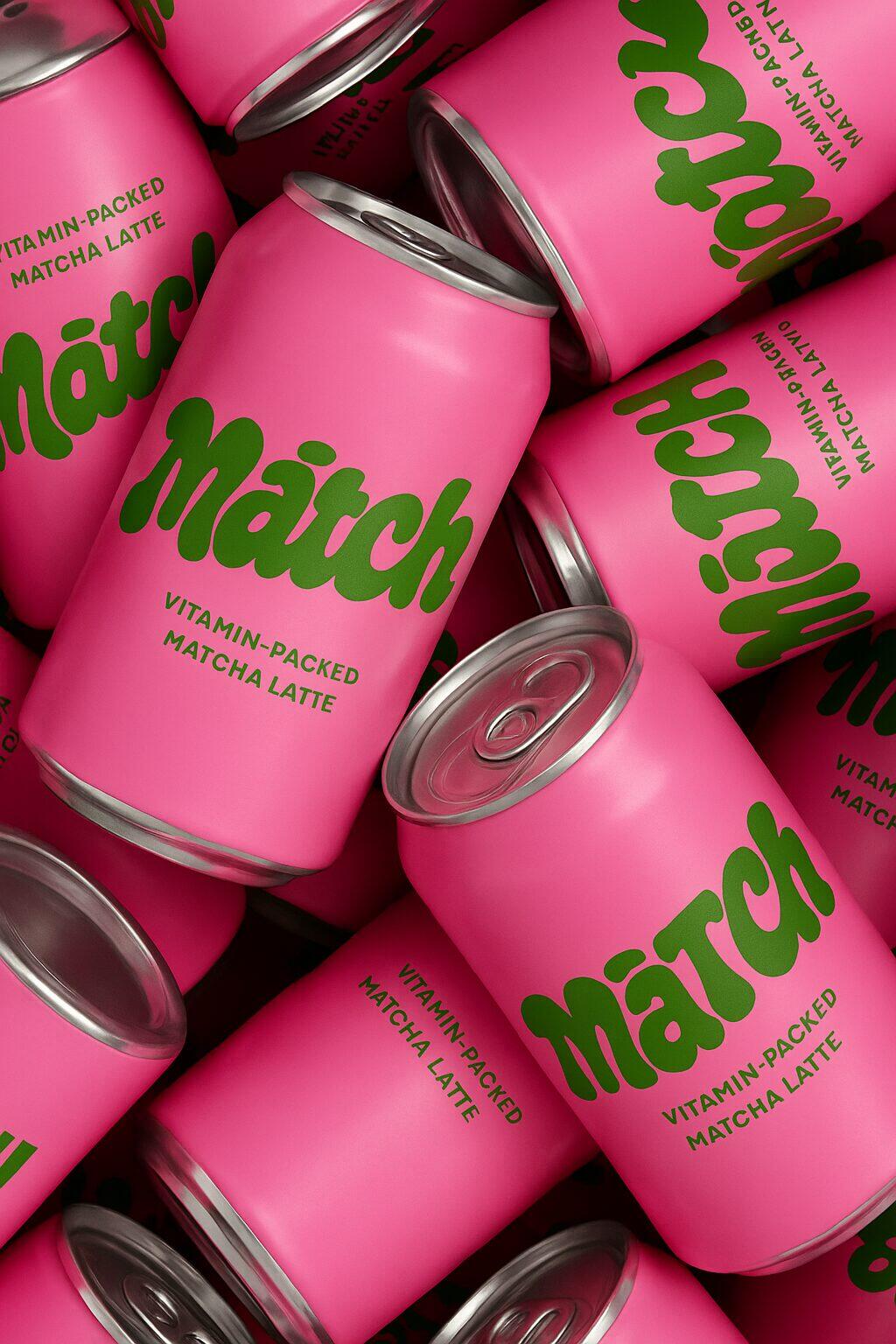
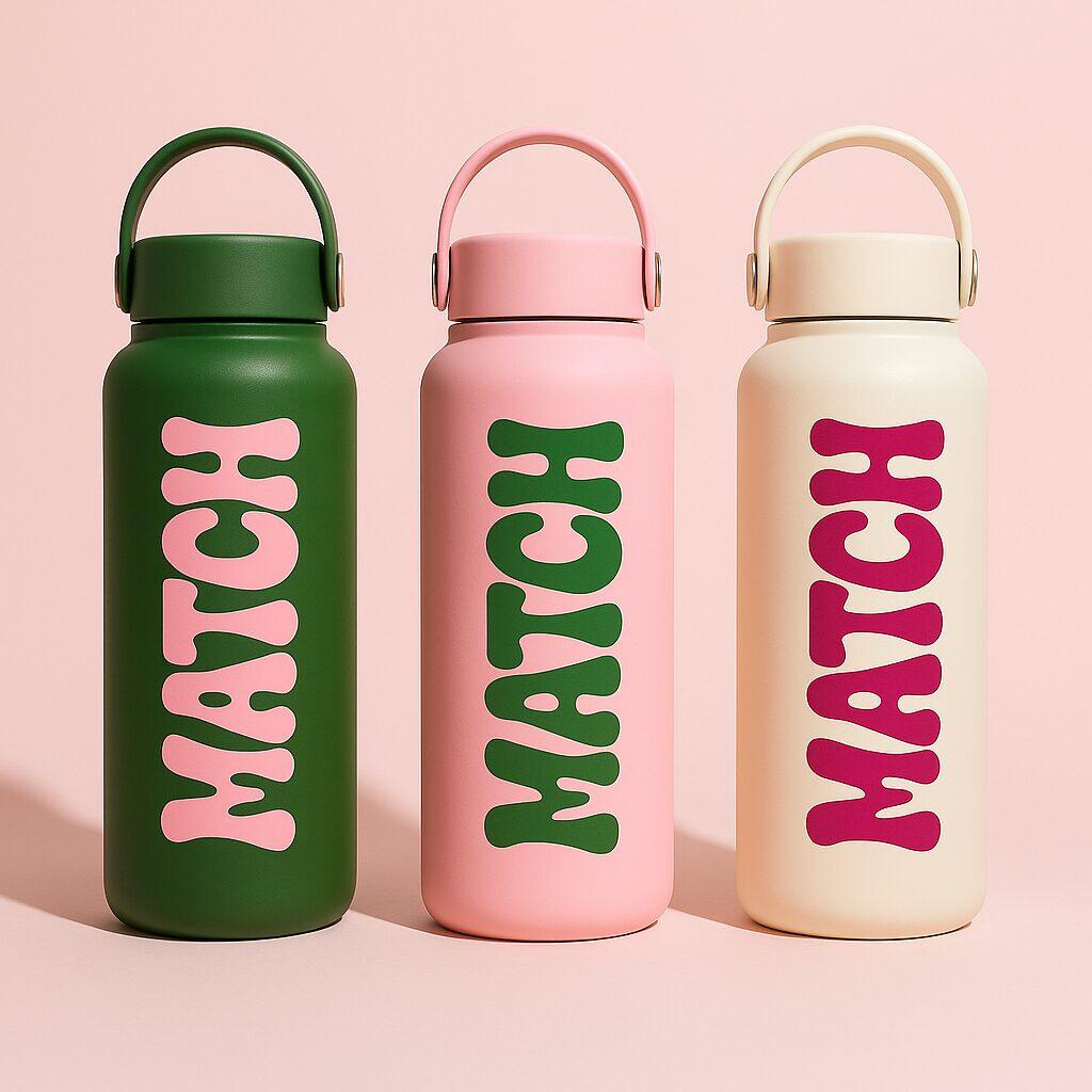
We developed a complete set of conceptual products to show how MATCH would live in the real world.
-matcha cans that are loud, bright and instantly eye-catching
-takeaway cups with a matching cardboard carry-holder
-reusable bottles in several color variations, reflecting the brand palette
All items share the same groovy typography, rounded shapes and contrasting pastel-meets-neon tones, making the identity instantly recognizable.
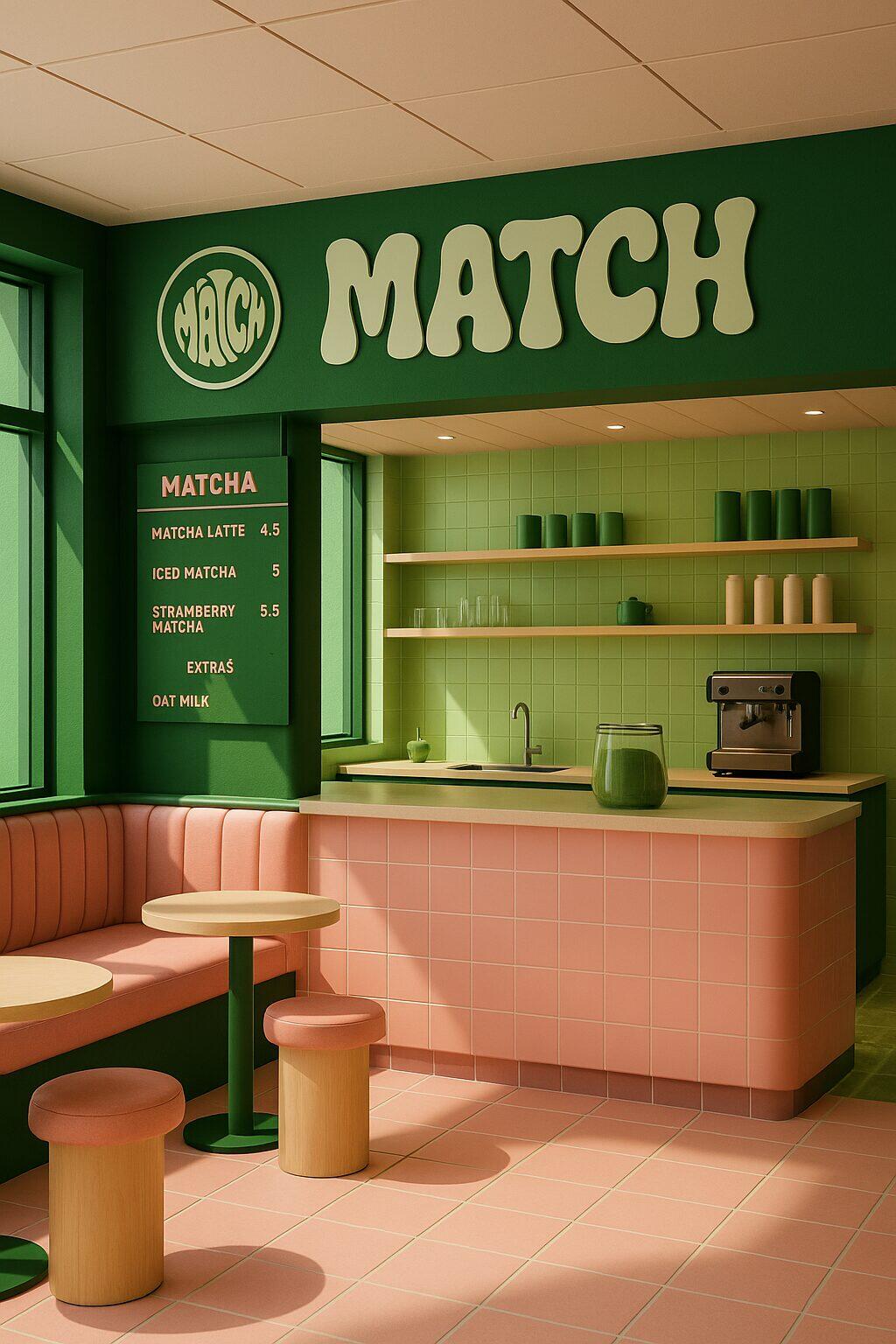
Brand Universe & Café Concept
MATCH also includes a complete café concept, imagined as a cozy and modern space entirely built around the brand’s playful energy. The interior uses citrus greens, pastel pinks, retro curves and matte textures to create a warm and Instagrammable environment. The space feels like stepping into a 70s-inspired matcha world, but reimagined in a fresh and contemporary way.
Purpose of the Project
This project demonstrates how a simple beverage idea can be transformed into a full lifestyle brand through strong visual storytelling and creative direction. MATCH shows that matcha doesn’t have to be minimal and traditional; it can be bold, groovy and unapologetically fun.
Category:
Date:
May 26, 2025